Choosing the right furniture color can be tricky, but it’s also where the real fun begins! 😍 Whether you’re sprucing up your living room or giving your bedroom a brand-new vibe, the color of your furniture plays a major role in setting the tone of your space. From calming neutrals to bold statement hues, this guide will help you nail your color choices and create a home that feels just right.
Color is powerful. It can energize a room, evoke calm, or make a space feel larger (or cozier). When choosing furniture colors, it’s essential to consider not just personal preferences but also how those colors will interact with lighting, wall colors, and the overall vibe you want to achieve. Ready to create a color-coordinated home that feels balanced and beautiful? Let’s dive into the world of furniture colors! 🌈✨
1. The Power of Neutrals: Timeless and Elegant 🖤🤍
Let’s start with the classics! Neutral colors are the ultimate foundation for any space. They’re chic, versatile, and work with just about everything. If you’re unsure which direction to take with your color palette, neutrals provide a safe yet stylish choice.
Why Choose Neutrals?
- 🛋️ Flexible: Neutrals like beige, gray, and taupe easily adapt to any style—modern, rustic, or traditional.
- 🎨 Perfect Backdrop: They allow you to go bold with accessories (think colorful cushions, rugs, and artwork).
- 📸 Timeless Appeal: You won’t get tired of them in six months, and they’re less likely to go out of style.
Popular Neutral Shades:
- Cool Grays: Perfect for creating a modern, minimalist look.
- Warm Beiges and Taupes: Add warmth and coziness to any space.
- Ivory or Off-White: Brighten up a room without the starkness of pure white.
Pro Tip:
Layer different neutral tones for depth. Combine warm beiges with cool grays for a sophisticated, textured look. Add texture through throws, rugs, and pillows to prevent the space from feeling flat.
2. Bold and Beautiful: Make a Statement 🌈🔥
Want your furniture to be the life of the party? Bold colors are your best friends! 🎉 If you love injecting personality into your home, don’t shy away from vibrant hues that demand attention.
Eye-Catching Colors to Consider:
- 💙 Deep Blues: Moody and dramatic, perfect for sofas or accent chairs.
- 💛 Mustard Yellow: Adds warmth and energy, especially in modern or boho spaces.
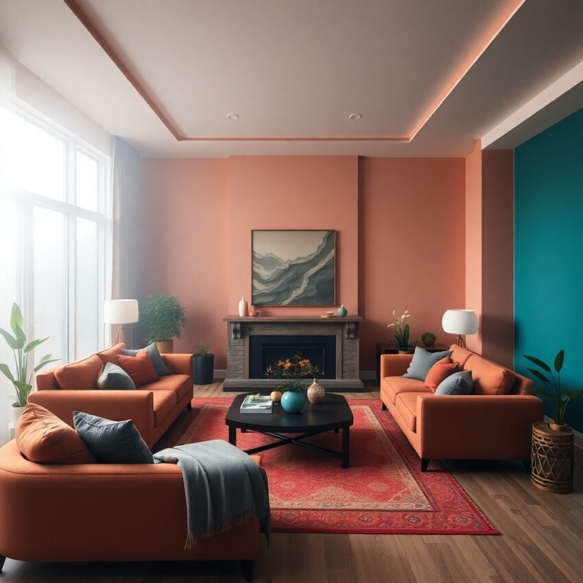
- 🧡 Burnt Orange: Cozy and inviting, ideal for autumn-inspired interiors.
- 💚 Emerald Green: Luxurious and striking, adding a touch of elegance to any room.
How to Use Bold Colors:
- Accent Pieces: Use bold hues for smaller items like ottomans, chairs, or coffee tables to add pops of color without overwhelming the space.
- Feature Furniture: A bright sofa or armchair can become the focal point of your living room.
- Balance with Neutrals: Keep walls and large accessories neutral to let the bold furniture take center stage.
Pro Tip:
If you’re going bold, balance it with lighter accessories and plenty of natural light to avoid making the space feel cramped.
3. Soft Pastels: Gentle and Dreamy 🌸🌿
Pastels are having a moment, and we’re here for it! These soft, calming colors are perfect for creating serene, peaceful spaces. Pastels work especially well in bedrooms, nurseries, and cozy living spaces, where you want a relaxing vibe.
Best Pastel Choices:
- 💚 Sage Green: Relaxing and fresh—great for bedrooms or cozy reading nooks.
- 💖 Blush Pink: Adds a touch of romance and warmth without being too loud.
- 💙 Powder Blue: Light and airy, giving off beachy, coastal vibes.
- 💛 Soft Yellow: Brings warmth and happiness without being overpowering.
How to Style Pastels:
- Pair pastels with natural materials like light wood, rattan, or linen for a soft, harmonious look.
- Use pastels on larger furniture pieces like sofas and beds for a dreamy effect.
- Layer textures to prevent pastel-heavy spaces from feeling too flat.
4. Dark and Moody: Luxe and Sophisticated 🖤🌌
If you want your home to feel like a high-end retreat, consider embracing dark, moody furniture. It’s bold, confident, and undeniably chic. Dark tones add drama and create a cozy, intimate atmosphere, especially in larger spaces.
Colors That Turn Heads:
- 🖤 Charcoal or Black: Dramatic and edgy—perfect for modern or industrial spaces.
- 🫐 Deep Forest Green or Navy: Rich and cozy, these colors feel luxurious without being too overpowering.
- 🍷 Burgundy or Aubergine: Adds a touch of opulence for vintage-inspired or eclectic interiors.
Styling Tips:
- Pair dark furniture with metallic accents (gold, brass, or copper) to add sparkle and balance the darkness.
- Use mirrors and layered lighting to prevent the room from feeling too heavy.
- Add soft textures (velvet cushions, faux fur throws) to enhance the cozy, sophisticated vibe.
5. Nature-Inspired Hues: Fresh and Inviting 🌿☀️
Bring the outdoors in with colors inspired by nature! Think soft greens, earthy browns, and sunny yellows that create a warm, organic vibe. Nature-inspired colors have a calming effect and help connect your home to the natural world.
Popular Nature-Inspired Shades:
- 🌾 Olive Green: Earthy and grounding—pairs beautifully with terracotta and cream.
- 🌞 Ochre: A deeper yellow that feels cozy and inviting.
- 🌊 Ocean Blue: Perfect for creating a calm, coastal atmosphere.
- 🌲 Earthy Browns: Warm and rustic, great for farmhouse or boho styles.
Pro Tip:
Add houseplants and woven textures to enhance the natural vibe. Furniture made from natural materials like reclaimed wood, rattan, or bamboo complements these colors beautifully.
6. Mixing and Matching: Find Your Perfect Balance ⚖️🎨
Why settle for one color when you can mix and match? The trick is to strike the right balance between bold and subtle, creating a layered, cohesive look.
Easy Mixing Tips:
- 🌟 Rule of Three: Stick to three main colors—one dominant, one secondary, and one for accents.
- 🪑 Match Tones: Keep warm tones together (mustard, terracotta, olive) or cool tones together (blue, gray, green).
- 📚 Use Accessories: Test out color combinations with throws, cushions, and rugs before committing to big furniture pieces.
Example Combinations:
- Cool and Calm: Combine sage green with soft gray and dusty blue for a tranquil vibe.
- Warm and Cozy: Pair burnt orange with ochre and earthy brown for a welcoming, autumnal feel.
- Modern and Chic: Blend charcoal with deep green and metallic gold accents for a luxe, moody look.
7. Conclusion: Your Color, Your Story 🎨💫
The colors you choose for your furniture are more than just design decisions—they’re a reflection of your personality and the story you want your home to tell. Whether you lean toward timeless neutrals, bold statement hues, or calming pastels, there’s no wrong answer—only what feels right for you.
Final Tips for Success:
- Consider Your Lifestyle: If you have kids or pets, opt for durable fabrics and darker shades that can handle wear and tear.
- Test Before Committing: Bring home fabric swatches and color samples to see how they look in your space.
- Have Fun! Don’t be afraid to experiment and mix things up. Your home should be a place that reflects your unique style.
So go ahead, get creative, and have fun with it! 🛋️✨ Your perfect palette is waiting to be discovered.